Different colors not only provide aesthetic value to the interior space or objects, but they also control emotions, actions, and even a general state of people. No matter if you are creating a calm bedroom, a workspace in the home office, or a comfortable living room. It is important to consider the impact of the color to the overall spaces that you plan to have.
Now let’s dive into how colours affect us and give viable pointers for getting the right colour for each room of your home.
The Impact of Colour on Perceived Mood and Behaviour
Colours touch our minds and our bodies and in some ways they are both amazingly simple and powerfully profound. What is more, some of the shades make people feel relaxed, laying emphasis on leisure, whereas others can call into action and stir people’s enthusiasm. Here’s a quick look at the psychological effects of common color groups:
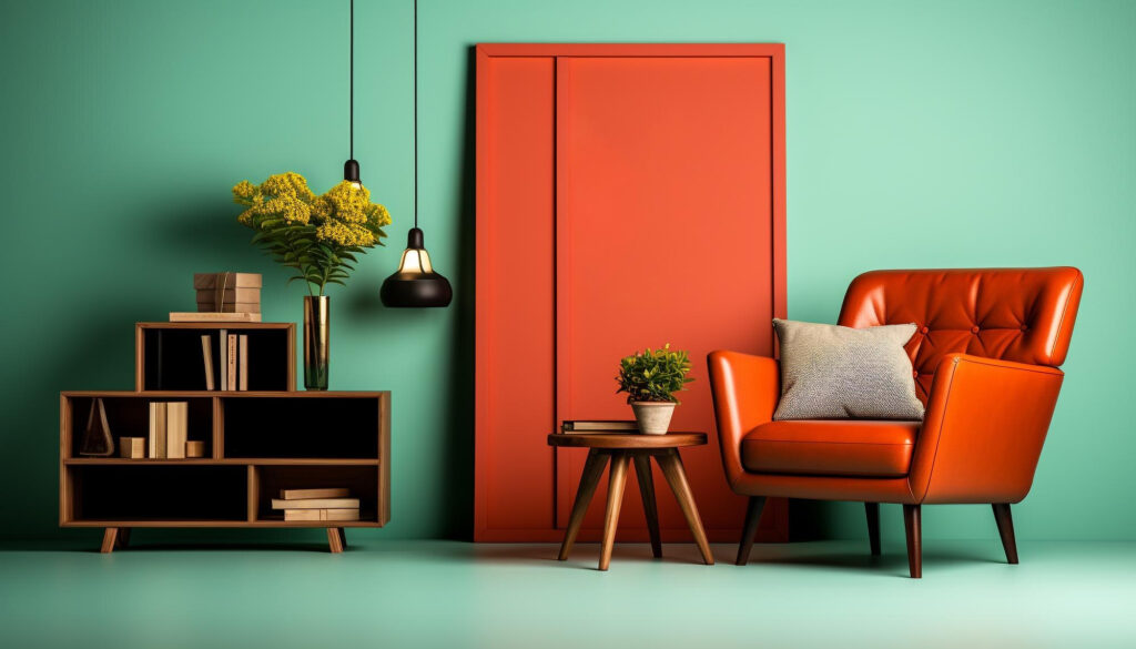
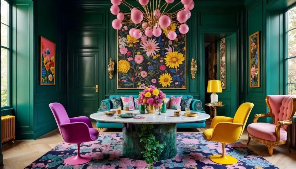
Warm Colors (Red, Orange, Yellow): These colors are exciting and cause people to take note, they could be used to help energize people and get them talking.
Cool Colors (Blue, Green, Purple): More ideal for rooms used for reading or any purpose which requires less sound interference; they are soothing and easy on the eye.
Neutral Colors (White, Gray, Beige): These everlasting notes lend neutrality, which makes spaces look vast, sterilized, and quite universal.
Bold and Dark Colors (Black, Navy, Deep Green): These give drama and elegance but need to be used occasionally so as not to overemphasize a particular area.
How to Choose Color Schemes Suitable for the Room
- Living Room: Welcoming and Energizing
The fact that most families and their close ones get comfortable in the living room, often known as the main entertainment center of the house. It is always safe to choose an organizational color scheme that is neutral but exciting enough to wake up one’s enthusiasm.
Ideal Colors: Soft and warm like shades of beige or taupe, soft yellow, muted green color.
Tip: Pop some rays of even more intense colors, such as coral or teal, by the use of cushions, rugs, or paintings.
- Kitchen: Bright and Cheerful
The kitchen as a working space, a place of idea implementation, is rather appropriate for the bright and fresh colors.
Ideal Colors: Light colors, such as white or light gray, because they are clean and breathe-friendly colors such as yellow, orange, or green if you want to add liveliness to your kitchen.
Tip: Incorporate colored cabs or tiles but be careful not to overdo the whole display.
- Bedroom: Calm and Restful
Bedroom particularly requires seclusion from outside activities as well as noise for relaxation and the sweet night sleep it deserves. Sticking to soft, cool colors helps to create a relaxing atmosphere.
Ideal Colors: Pale blue, sage, or powder blue, or lavender colors.
Tip: These colours are not good to be used anywhere mostly during the day or at night because they disturb further relaxation.
- Bathroom: Clean and Rejuvenating
Some rooms are both utilitarian and leisurely. Regarding the underlying colours, white and grey can be mixed with a dash of energetic colour scheme to achieve quite cleanliness.
Ideal Colors: Soft pastel colours as in whites, light gray and baby blues.
Tip: Introduce a spa atmosphere by adding some natural colors like sage green or sand beige.
- Home Office: Focus and Productivity
Your environment should motivate productivity and come up with new ideas. Most of all, colors that get the mind going or soothe it by not inducing stress are important here.
Ideal Colors: Pale green, blue, or light gray shades.
Tip: It is suggested to change furniture and appliances sometimes, that is, add a bright colored accent wall paint such as mustard yellow or burnt orange to stimulate creativity.
- Dining Room: Warm and Inviting
The dining room should foster conversation and appetite, and thus a warm, rich color should be adopted.
Ideal Colors: Succulent raspberry or strawberry reds as well as spicy, terracotta-like oranges and rich earthen tones of brown.
Tip: Don’t make all the walls of your home very dark; instead, use dark furniture or accessories in combination with lighter ones in order not to make the room too dramatic and intense.
Some Common Guidelines of Colour Selection
Understand Lighting: As is known, colors appear differently under natural and artificial light. Never buy light shades that will appear different under specific lighting environments.
Use the 60-30-10 Rule: Draw a color scheme plan such that the first color occupies 60% of space (walls), the second color occupies 30% (the furniture and fixtures), and the third color occupies 10% (accessories and ornaments).
Experiment with Textures: If one finds using bold colors a bit messy, one can use fabric, wallpaper, or accessories that provide texture in such colors.
Create Real-Life Psychology of Colors and Painting with Inlight Interiors!
Selecting the colors for home decoration can also be daunting, especially if not guided. It is one of the best ways to transform the appearance of your house. At Inlight Interiors, we believe in bringing a little bit of yourself into your home to make it more fun and enjoyable to live in there.
With our friendly team, let’s make your bedrooms as calm as they should be and your kitchens as warm as they should become.
You are just a few clicks away from making the perfect color palette for your home. Contact us today at Inlight Interiors and let Inlight Interiors help make your vision a reality.